
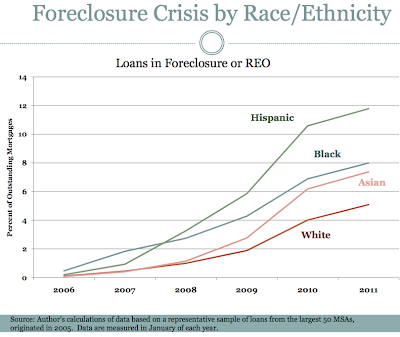
Here's a graph created by Dr. Carolina Reid of the Federal Reserve Bank of San Francisco tracking foreclosure rates over time on mortgages originated in 2005. This is for the 50 largest metro areas, so it's reasonably representative of the bulk of the mortgage dollars in the U.S.
In thinking about the Great Recession and foreclosures, we need to conceptually distinguish between later foreclosures caused by the recession versus earlier foreclosures that, more than any other single factor in the U.S., caused the recession. (Obviously, the recession had multiple causes, which can be analyzed on multiple levels, just as World War I can be said to be caused (at the specific level) by both the assassination of the Archduke or (at an abstract level) the system of Great Power rivalries. But for historical events as important as the Great War and the Great Recession, it's worth taking the trouble to analyze multiple causes at multiple levels. The mortgage meltdown may not have been the ultimate cause of the recent economic unpleasantness, but it deserves close analysis, just as the assassination of the Archduke, the stock market crash of 1929, and the bombing of Pearl Harbor deserve the attention paid to them.)
The foreclosures rates in this graph are for January of each year. Keep in mind that foreclosures lag defaults by some number of months.
Some recent history: The subprime crisis was first noticed in February 2007 with the failure of subprime lender New Century Financial in Orange County. So, the first two data points, 2006 and 2007, are both before subprime blew up. The Great Recession itself did not become a certainty until mid-September 2008, and unemployment rose in the wake of those memorable fall 2008 events. Not surprisingly, broad unemployment caused numerous foreclosures.
But, what's of more interest in figuring out cause and effect are the foreclosures that happened before the country fell into a general recession. This study of 2005 vintage mortgages offers some interesting clues. Here's Reid's map of foreclosures as of January 2007:

As you can see, foreclosures were centered around Greater Detroit
Not surprisingly, in those first two years, while the price of houses was still high, blacks had the highest foreclosure rates. The financial cost of these mortgages defaults was low, however, because home prices in the Great Lakes area are not particularly high.
But, by 35 months later, at the end of 2010, the landscape was dominated by the red of the Sand States of California (the Big Kahuna of real estate values), Arizona, Nevada, and Florida:
 As the top graph demonstrates and the second map implies, the Hispanic rate skyrocketed between January 2007 and January 2009. By January 2009, the Hispanic foreclosure rate (about 6%) was roughly three times the white rate (about 2% rate), and the Hispanic rate was now significantly higher than the black rate. The Hispanic foreclosure rate accelerated from January 2009 to January 2010 (roughly the second map), reaching about 10.5%, before its rate of growth moderated from January 2010 to 2011.
More than any other ethnic group, Hispanics blew up and then popped the bubble.
Interestingly, the Asian rate grew sharply over the course of 2009, almost catching up to the black rate. The white foreclosure rate lagged the other ethnicities rates, finally closing some of the gap by January 2011, suggesting that white borrowers tended to be less cause than victim of the recession.
The more I look at the recent studies, the more I keep coming back to my initial reaction: Diversity, in the multiple meanings we assign that term, played a major role in the Recent Economic Unpleasantness. You might think that knowing this would be relevant to immigration policy, but that just shows you are a bad person.


